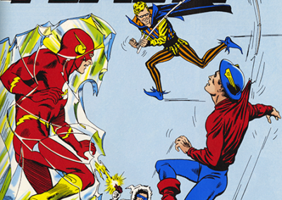
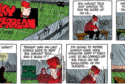
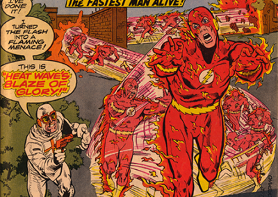
Another important aspect of the art contained herein is the coloring of the Sunday strips. The hues, handled by Lee Loughridge, and in 2004 by Matt Hollingsworth, also lend themselves to propelling the work forward and become another element in the expression of the kind of stories that I wanted to tell. If I may, allow me a moment to take a step back to help put things in context a bit.
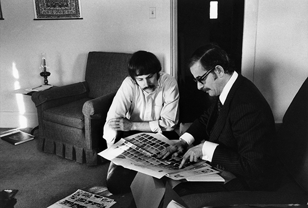
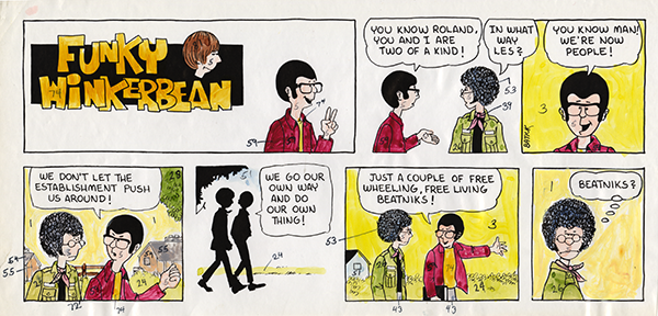
A couple of months after I had started Funky, Richard Sherry, the editor of Publishers Hall Syndicate, came to see me at my apartment in Elyria. It was a very thoughtful touching bases kind of visit, and, while there, he used the opportunity to impart some fatherly advice about how to handle what had just happened to me, and, I think, keep me from being paralyzed by luck (that’s a thing) and unintentionally putting a match to the new Funky project we were beginning to build. The conversation covered financial advice, psychological don’tlet- this-all-go-straight-to-your-head-advice, and some technical stuff as well, among which were his thoughts on coloring. As good as all of the other advice was, he kind of messed me up with the coloring part. Back then, you colored your completed Sunday strip by making a photocopy or putting a tracing paper overlay on top of the finished inks, adding the colors with markers, and then numbering the colors to match a standardized coloring chart that would tell the printer the exact combinations of red, yellow, and blue that you wanted.
The chart itself was pretty limited, and Sherry worked to limit it even more by telling me to ignore about two-thirds of it and just stick with the brighter primary color combinations. As a junior high art teacher at that point, I definitely was acquainted with the concept of using primary colors. In class we would use fire-engine red and daisy yellow paints and glazes by the barrel because the junior high art palette just isn’t all that sophisticated. And neither was the look of the Sunday comics at that point—thanks to the ongoing shrinking of the comics and the switch from crisp rotogravure printing cylinders to the mushier look of paper mats and zinc plates. It looked like the comics were being printed with warm Hershey bars. In response, the comics were simplifying their look to accommodate the new realities of newspaper comics printing. So Sherry’s advice was in step with what all of the syndicates were thinking at the time, which was to keep lowering the bar right along with the newspapers. Sherry called the colors on the chart that he wanted me to avoid “muddy” colors. The comic book colorists that I would later bring on board not only didn’t avoid those “muddy” colors . . . they moved in and set up shop smack in the middle of “muddy color land.”
From the introduction to The Complete Funky Winkerbean Volume 11


